

浏览器如何运作
# 解析# 浏览器# BNF# CSS# DOM# HTML# JavaScript
现代 web 浏览器的背后
英文原文于 2011 年 8 月 5 日发布在 web.dev 上 (原文链接)
序
这份关于 WebKit 和 Gecko 内部操作的全面入门材料,是以色列开发人员 Tali Garsiel 所做的大量研究的结果。在过去的几年里,她审阅了所有关于浏览器内部结构的公开数据,并花了大量时间阅读网络浏览器的源代码。她写道:
Tali 在她的网站上发表了她的研究,但我们知道这值得被广泛传播,所以我们把它整理了一下,并在这里重新发表。
作为一名 web 开发人员,了解浏览器内部的操作原理可以帮助你做出更好的决策,并了解最佳开发方法背后的理由。虽然这是一个相当长的文档,但我们建议您花些时间深入研究。我们保证你研究完之后会很满意。
– Paul Irish, Chrome Developer Relations
简介
Web 浏览器是使用最为广泛的软件。在本文中,我将解释它们在幕后是如何工作的。从你在地址栏中输入 google.com 开始,直到浏览器屏幕上显示谷歌页面为止,浏览器到底干了些什么?让我们一起来探究这个过程。
我们将要讨论的浏览器
现在有五种主要的桌面浏览器:Chrome, Internet Explorer, Firefox, Safari 和 Opera。在移动端,主要的浏览器有 Android 浏览器、iPhone、Opera Mini 和 Opera mobile、UC 浏览器、Nokia S40/S60 浏览器和 Chrome。在这其中,除了 Opera 浏览器,其他浏览器都基于 WebKit。我将从开源浏览器 Firefox 和 Chrome 以及 Safari (部分开源) 中举例。根据 StatCounter 的统计数据 (截至 2013 年 6 月),Chrome、Firefox 和 Safari 占据了全球桌面浏览器使用量的 71% 左右。在移动设备上,Android 浏览器、iPhone 和 Chrome 的使用率约为 54%。
浏览器的主要功能
浏览器的主要功能是,从服务器请求所选择的 web 资源,并在浏览器窗口中显示它们。这些资源通常是HTML文档,但也可能是 PDF、图像或其他类型的内容。资源的位置由用户使用 URI (Uniform Resource Identifier,统一资源标识符) 指定。
浏览器解释和显示 HTML 文件的方式由 HTML 和 CSS 的规范指定。这些规范由 W3C (World Wide Web Consortium,万维网联盟) 组织维护,该组织是 web 的标准组织。多年来,浏览器只遵循了部分规范,并开发了自己的扩展。这给网页作者带来了严重的兼容性问题。如今,大多数浏览器或多或少都符合规范。
浏览器用户界面之间有很多共同之处。常见的用户界面元素有:
- 用于插入 URI 的地址栏
- 后退和前进按钮
- 书签选项
- 刷新和停止按钮,用于刷新或停止对当前文档的加载
- 返回主页的 Home 按钮
奇怪的是,没有任何正式的规范指定了浏览器的用户界面。这只是来自于多年的经验和浏览器相互模仿而形成的良好结果。HTML5 规范没有定义浏览器必须拥有的 UI (User Interface,用户界面) 元素,但还是列出了一些常见元素。其中包括地址栏、状态栏和工具栏。当然,某些浏览器也有其独特的功能,比如 Firefox 的下载管理器。
浏览器的宏观结构
浏览器的主要组成部分有:
- 用户界面:包括地址栏、后退/前进按钮、书签菜单等。这包含浏览器显示的每个部分,除了您查看请求页面的窗口。
- 浏览器引擎:整合渲染引擎并构建 UI。
- 渲染引擎:负责显示请求的内容。例如,如果请求的内容是 HTML 页面,呈现引擎将解析 HTML 和 CSS,并在屏幕上显示解析后的内容。
- 网络:对于网络调用 (如 HTTP 请求),在与平台无关的接口后面使用针对不同平台的不同实现。
- UI 后端:用于绘制基本的小部件,如组件 (combo box) 和窗口。这个后端暴露了一个平台通用的接口。它向下直接调用操作系统 UI 相关的方法。
- JavaScript 解释器:用于解析和执行 JavaScript 代码。
- 数据存储:这是一个持久层。浏览器可能需要在本地保存各种数据,比如 cookie。浏览器还支持 localStorage、IndexedDB、WebSQL 和文件系统等存储机制。
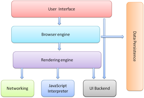
需要注意的是,浏览器 (如 Chrome) 会运行多个渲染引擎实例:每个页面一个实例。每个页面在单独的进程中运行。
渲染引擎
渲染引擎的职责嘛…就是渲染,即在浏览器屏幕上显示所请求的内容。
默认情况下,渲染引擎可以显示 HTML 和 XML 文档和图像。它可以通过安装插件或扩展来显示其他类型的数据。例如,使用 PDF 查看器插件显示 PDF 文档。然而,在本章中,我们将关注主要的用例:显示使用 CSS 格式化的 HTML 和图像。
多种渲染引擎
不同的浏览器使用不同的渲染引擎:Internet Explorer 使用 Trident, Firefox 使用 Gecko, Safari 使用 WebKit。Chrome 和 Opera (从版本 15 开始) 使用 Blink,这是 WebKit 的一个分支。
WebKit 是一个开源的渲染引擎,最初用于 Linux 平台,后来被苹果修改为支持 Mac 和 Windows。详情请参见webkit.org。
渲染的主要流程
渲染引擎将开始从网络层获取所请求文档的内容。这些内容通常被分为很多 8kB 的块。
以下是渲染引擎的基本流程:

The rendering engine will start parsing the HTML document and convert elements to DOM nodes in a tree called the “content tree”. The engine will parse the style data, both in external CSS files and in style elements. Styling information together with visual instructions in the HTML will be used to create another tree: the render tree.
渲染引擎将开始解析 HTML 文档,并将元素转换为称为 “content tree” 的树中的 DOM 节点。引擎将解析外部 CSS 文件和样式元素中的样式数据。样式信息和 HTML 中的可视指令将用于创建另一棵树:渲染树。
渲染树包含具有颜色和尺寸等视觉属性的矩形渲染区域。这些矩形以正确的次序显示在屏幕上。
After the construction of the render tree it goes through a “layout” process. This means giving each node the exact coordinates where it should appear on the screen. The next stage is painting - the render tree will be traversed and each node will be painted using the UI backend layer.
在构建渲染树之后,它会经历一个“布局”过程。这意味着为树中每个节点提供它应该出现在屏幕上的确切坐标。下一个阶段是绘制——渲染树将被遍历,每个节点将使用UI后端层绘制。
重要的是要明白,这是一个渐进的过程。为了更好的用户体验,渲染引擎会尽量在屏幕上尽快显示内容。它不会等到所有 HTML 都解析完毕后才开始构建和布局渲染树。部分内容将提前被解析和显示,而随着来自网络的其余内容到达,该过渲染过程将继续。
主要流程的实际例子
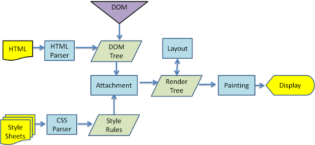
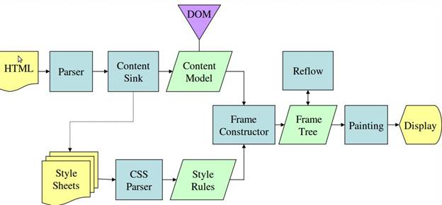
Mozilla 的 Gecko 渲染引擎从图 3 和图 4 可以看到,尽管 WebKit 和 Gecko 使用的术语略有不同,但流程基本上是相同的。
Gecko 称视觉上格式化的元素树为“Frame tree”。每个元素都是一个 Frame。WebKit 使用术语“Render Tree”,它由“Render Objects”组成。WebKit 使用术语“Layout”来放置元素,而 Gecko 称之为“Reflow”。“Attachment”是 WebKit 用于连接 DOM 节点和可视信息以创建渲染树的术语。一个微小的非语义差异是,Gecko 在 HTML 和 DOM 树之间有一个额外的层。它被称为“Content Sink”(内容槽),是制作 DOM 元素的工厂。我们将讨论流程的每个部分:
解析-简介
由于解析在呈现引擎中是一个非常重要的过程,我们需要更深入地讨论它。让我们先简单介绍一下解析。
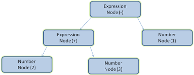
解析文档意味着将其转换为程序可以使用的结构。解析的结果通常是表示文档结构的节点树。这被称为解析树(parse tree)或语法树。
例如,解析表达式 2 + 3 - 1 将返回下面这个解析树:
语法
Parsing is based on the syntax rules the document obeys: the language or format it was written in. Every format you can parse must have deterministic grammar consisting of vocabulary and syntax rules. It is called a context free grammar. Human languages are not such languages and therefore cannot be parsed with conventional parsing techniques.
解析过程基于文档的句法 (syntax,语言中单词或语句的排列方式)。文档遵循的句法,指的是编写文档的语言或格式。每种可以解析的格式都必须具有确定的语法 (grammar,语言的整体结构和用法),一般由词汇和句法规则组成。这被称为上下文无关语法。人类语言不是这样的语言,因此不能用传统的解析技术进行解析。
解析器-词法分析器 (Lexer) 的组合
解析过程可以分为两个子过程:词法分析 (lexical analysis) 和句法分析。
词法分析是将程序输入分解为标记 (Token) 的过程。标记是语言的词汇,即有效构组成成分的集合。在人类语言中,它由词典中出现的该语言的所有单词组成。
句法分析是运用语言句法的规则。
解析器通常将任务划分为两个部分:词法分析器 (有时称为标记器,tokenizer) 负责将输入分解为有效的标记;解析器负责根据句法规则分析文档结构,来构造解析树。
词法分析器知道如何去除不相关的字符,如空格和换行符。
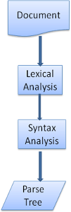
解析过程是迭代的。解析器通常会向词法分析器请求一个新的标记,并尝试将该标记与语法规则之一匹配。如果匹配到规则,则与该标记对应的节点将被添加到解析树中,解析器将请求另一个标记。
如果没有匹配的规则,解析器将在内部存储标记,并继续请求标记,直到找到与所有内部存储的标记匹配的规则。如果没有找到规则,解析器将抛出异常。这意味着文档无效并且包含句法错误。
翻译
在许多情况下,解析树并不是最终产物。解析通常用于翻译:将输入文档转换为另一种格式。一个较好的例子就是“编译”。编译器能将源代码编译为机器码。它首先将其解析为解析树,然后将树转换为机器码文档。
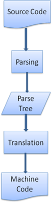
解析过程的例子
在图 5 中,我们根据一个数学表达式构建了解析树。让我们尝试定义一种简单的数学语言,并观察解析表达式的过程。
句法:
- 这个语言中,句法的基本单元是“表达式”、“项”和“操作”
- 我们的语言可以包含任意数量的“表达式”
- “表达式”定义为“项”后面跟着“操作”,后面跟着另一个“项”
- 一个“操作”是一个“加号”或“减号”
- “项”是一个“整数”或“表达式”
我们分析一下输入 2 + 3 - 1。
配规则的第一个子字符串是 2:根据规则 #5,它是一个项。
第二个匹配是 2 + 3,它匹配规则 #3:一个项后面跟着一个操作,后面跟着另一个项。
下一个匹配只会在输入的末尾被确认。
2 + 3 - 1 是一个表达式,因为我们已经知道 2 + 3 是一个项,所以我们有一个项,后面跟着一个运算,后面跟着另一个项。
2 + + 不会匹配任何规则,因此是无效输入。
词汇和句法的正式定义
词汇表通常由正则表达式表示。
例如,将我们语言的词汇定义为:
INTEGER: 0|[1-9][0-9]*
PLUS: +
MINUS: -
如您所见,整数是由正则表达式定义的。
句法通常以一种称为 BNF (Backus–Naur form,逆波兰表达式) 的格式定义。 我们的语言被定义为:
expression :=  term  operation  term
operation :=  PLUS | MINUS
term := INTEGER | expression
我们说过,如果一种语言的语法是与上下文无关的语法,那么它就可以被常规解析器解析。 上下文无关语法的直观定义是,可以完全用 BNF 表示的语法。 有关 BNF 的正式定义,请参阅维基百科的文章:上下文无关语法
解析器的类型
有两种类型的解析器:自顶向下解析器和自底向上解析器。一种直观的解释是,自顶向下解析器检查语法的高级结构,并试图找到匹配的规则。自底向上解析器从输入开始,逐步将其转换为语法规则,从低级规则开始,直到满足高级规则。
让我们看看这两种类型的解析器将如何解析我们的示例。
自顶向下解析器将从更高级别的规则开始:它将把 2 + 3 标识为表达式。然后,它将 2 + 3 - 1 标识为表达式 (识别表达式的过程不断推进,匹配其他规则,但起点是最高级别的规则)。
自底向上解析器将按一个方向扫描输入,直到匹配到规则。然后它将用规则替换匹配的输入。这将一直持续到输入的结束。部分匹配的表达式放在解析器的堆栈上。
| 栈 | 输入 |
|---|---|
| 2 + 3 - 1 | |
| 项 | + 3 - 1 |
| 项 操作符 | 3 - 1 |
| 表达式 | - 1 |
| 表达式 操作符 | 1 |
| 表达式 |
这种类型的自底向上解析器称为 shift-reduce 解析器,因为输入是向右移动的 (想象一个指针首先指向输入起点并向右移动),并且逐渐被简化为句法规则。
自动生成解析器
有一些工具可以生成解析器。你向它们提供你的语言的语法——词汇和语法规则——它们就会生成一个可以工作的解析器。解析器生成器可能非常有用,因为手动创建并优化出一个解析器并不容易。手动创建解析器需要非常深入地理解解析过程。
WebKit 使用了两个著名的解析器生成器:用于创建词法分析器的 Flex,和用于创建解析器的 Bison (您可能会在它们中遇到 Lex 和 Yacc 这两个名称)。 Flex 的输入是一个包含标记的正则表达式定义的文件。 Bison 的输入是 BNF 格式的语言语法规则。
HTML 解析器
HTML 解析器的任务是将 HTML 标记解析为解析树。
HTML 语法定义
HTML 的词汇和语法在 W3C 组织创建的规范中定义。
不是上下文无关的语法
正如我们在解析的介绍中所看到的,语法的句法可以用像 BNF 这样的格式正式定义。
不幸的是,所有传统的解析器主题都不适用于 HTML (我提出它们并不是为了好玩 —— 它们将用于解析 CSS 和 JavaScript)。HTML 不能轻易地用解析器需要的上下文无关语法来定义。
定义 HTML 有一个正式的格式 —— DTD (Document Type Definition,文档类型定义) —— 但它不是一个与上下文无关的语法。
乍一看,这似乎很奇怪;HTML 非常接近XML。有很多可用的 XML 解析器。 HTML 有一种 XML 变体 —— XHTML —— 这有什么很大的区别吗?
区别在于 HTML 方法更“宽容”:它允许您省略某些标记(然后隐式添加),或者有时省略开始或结束标记,等等。 总的来说,它是一种“软”语法,与 XML 的僵硬和苛刻的语法相反。
这个看起来很小的细节却有很大的不同。 一方面,这是 HTML 如此受欢迎的主要原因:它可以容忍你的错误,让网页作者的生活更轻松。 另一方面,它使编写正式语法变得困难。总而言之,传统的解析器无法轻松解析 HTML,因为它的语法并不是上下文无关的。HTML 不能被 XML 解析器解析。
HTML DTD
HTML 的定义采用 DTD 格式。此格式用来定义 SGML (Standard Generalized Markup Language,标准通用标记语言) 家族的语言。该格式包含所有允许的元素、它们的属性和层次结构的定义。正如我们前面看到的,HTML 的 DTD 没有形成与上下文无关的语法。
DTD 有一些变体。DTD 的严格模式完全符合规范;但其他模式包含对过去浏览器使用的标记的支持,目的是向后兼容旧内容。 当前的严格 DTD 在这里: www.w3.org/TR/html4/strict.dtd
DOM
输出树(“解析树”)是 DOM 元素和属性节点的树。 DOM 是文档对象模型的简称。 它是 HTML 文档的对象表示,也是 HTML 元素与外部世界的接口,就像 JavaScript 一样。
树的根是“Document”对象。
DOM 与标记的关系几乎是一对一的。 例如:
<html>
  <body>
    <p>
      Hello World
    </p>
    <div> <img src="example.png"/></div>
  </body>
</html>
该标记将被转换为以下 DOM 树:
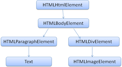
与 HTML 一样,DOM 是由 W3C 组织指定的,参考www.w3.org/DOM/DOMTR。 DOM 是操作文档的通用规范。其特定模块描述了 HTML 的特定元素。HTML 定义可以在这里找到: www.w3.org/TR/2003/REC-DOM-Level-2-HTML-20030109/idl-definitions.html。
当我说树包含 DOM 节点时,我想表达的是,树是由“实现 DOM 接口之一”的元素构成的。在浏览器使用的具体实现中,这个元素会包含浏览器内部所需的其他属性。
解析算法
正如我们在前几节中看到的,HTML 不能使用常规的自顶向下或自底向上解析器进行解析。
原因如下:
- 该语言本质上非常宽容。
- 浏览器能容错的事实。为了支持早期的 HTML,浏览器具有对历史版本的容错能力。
- 解析的过程中,源可能发生修改。对于其他语言,源在解析过程中不会改变,但在 HTML 中,动态代码 (例如包含
document.write()调用的脚本元素) 可以添加额外的标记,因此解析过程实际上会修改输入。
由于无法使用常规解析技术,浏览器会创建特定的解析器来解析 HTML。
解析算法在 HTML5 规范中有详细描述。 该算法分为两个阶段:标记化 (tokenization) 和树构造 (tree construction)。
标记化是词法分析,将输入解析为标记。 HTML 标记包括开始标记、结束标记、属性名和属性值。
标记器会识别标记,将其提供给树构造函数,并使用下一个字符来识别下一个标记,以此类推,直到输入结束。
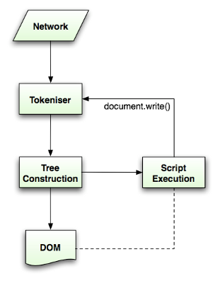
标记化算法
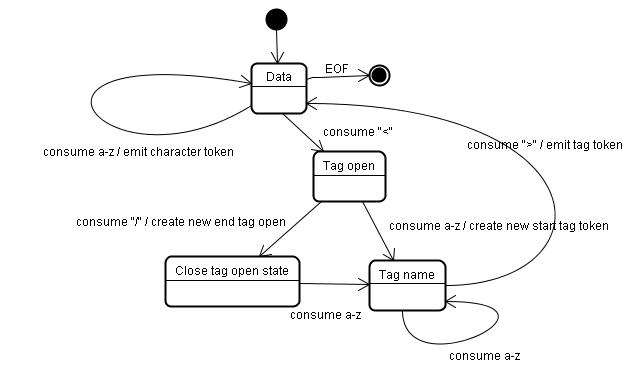
算法的输出是一个HTML标记。 该算法用一个状态机表示。 每个状态消耗输入流的一个或多个字符,并根据这些字符更新下一个状态。 该决策受到当前标记化状态和树构造状态的影响。 这意味着,根据当前状态的不同,消耗相同的字符将为正确的下一状态产生不同的结果。 很难完全描述这个复杂的算法,所以让我们看一个简单的例子来帮助我们理解原理。
基本示例 —— 标记以下 HTML:
<html>
  <body>
    Hello world
  </body>
</html>
初始状态是“Data”。
当遇到 < 字符时,状态被更改为 “Tag Open”。
使用一个 a-z 字符会导致创建一个“开始标记标记”,状态被更改为 “Tag Name”。
我们一直保持这种状态,直到 > 字符被消耗掉。每个字符都被追加到新的标记名。在我们的例子中,创建的标记是一个 html 标记。
当到达 > 标记时,发出当前标记,状态变回 “Data”。
标记 <body> 将按相同的步骤处理。
到目前为止, html 和 body 标签都已发出。现在我们回到了 “Data”。
消耗 Hello world 的 H 字符将导致创建和释放一个字符标记,直到到达 </body> 中的 < 为止。我们将为 Hello world 的每个字符发出一个字符标记。
我们现在回到了 “Tag Open”。
使用下一个输入 / 将导致创建一个结束标记标记,并移动到 “Tag Name”。我们再次保持这个状态,直到到达 >。然后将发出新的标记标记,我们返回到 “Data”。
输入 </html> 将像前一种情况一样处理。
树构造算法
When the parser is created the Document object is created. During the tree construction stage the DOM tree with the Document in its root will be modified and elements will be added to it. Each node emitted by the tokenizer will be processed by the tree constructor. For each token the specification defines which DOM element is relevant to it and will be created for this token. The element is added to the DOM tree, and also the stack of open elements. This stack is used to correct nesting mismatches and unclosed tags. The algorithm is also described as a state machine. The states are called “insertion modes”.
解析器创建的同时,Document 对象也随之创建。在树构造阶段,以 Document 为根的 DOM 树会被不断修改,元素被逐一添加进去。标记器发出的每个节点都会交由树构造器处理。规范为每种标记定义了与之对应的 DOM 元素,收到标记时就会创建相应的元素。元素不仅会被添加到 DOM 树中,还会被添加到未闭合元素栈中。这个栈用于纠正嵌套错误和未闭合的标记。该算法同样可以用状态机来描述,这些状态被称为“插入模式”(insertion mode)。
让我们看看示例输入的树构造过程:
<html>
  <body>
    Hello world
  </body>
</html>
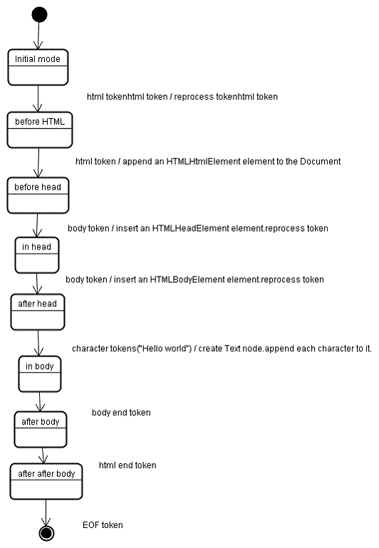
The input to the tree construction stage is a sequence of tokens from the tokenization stage. The first mode is the “initial mode”. Receiving the “html” token will cause a move to the “before html” mode and a reprocessing of the token in that mode. This will cause creation of the HTMLHtmlElement element, which will be appended to the root Document object.
树构造阶段的输入是标记化阶段产出的标记序列。第一个模式是 “initial mode”。接收到 “html” 标记后会转入 “before html” 模式,并在该模式下重新处理这个标记。这会创建 HTMLHtmlElement 元素,并把它追加到根 Document 对象上。
The state will be changed to “before head”. The “body” token is then received. An HTMLHeadElement will be created implicitly although we don’t have a “head” token and it will be added to the tree.
状态随后变为 “before head”。接着接收到 “body” 标记。虽然并没有 “head” 标记,但 HTMLHeadElement 仍会被隐式创建并添加到树中。
We now move to the “in head” mode and then to “after head”. The body token is reprocessed, an HTMLBodyElement is created and inserted and the mode is transferred to “in body”.
我们现在进入 “in head” 模式,随后是 “after head”。body 标记被重新处理,HTMLBodyElement 被创建并插入,模式转入 “in body”。
The character tokens of the “Hello world” string are now received. The first one will cause creation and insertion of a “Text” node and the other characters will be appended to that node.
现在接收到 “Hello world” 字符串的字符标记。第一个字符标记会创建并插入一个 “Text” 节点,其余字符则被追加到该节点上。
The receiving of the body end token will cause a transfer to “after body” mode. We will now receive the html end tag which will move us to “after after body” mode. Receiving the end of file token will end the parsing.
接收到 body 结束标记后转入 “after body” 模式。接着接收到 html 结束标记,进入 “after after body” 模式。收到文件结束标记后,解析结束。
解析结束后的动作
At this stage the browser will mark the document as interactive and start parsing scripts that are in “deferred” mode: those that should be executed after the document is parsed. The document state will be then set to “complete” and a “load” event will be fired.
在这个阶段,浏览器会把文档标记为可交互 (interactive),并开始解析处于 “deferred” 模式的脚本——也就是那些应当在文档解析完成后执行的脚本。随后文档状态被设置为 “complete”,并触发 “load” 事件。
你可以在 HTML5 规范中查看标记化和树构造的完整算法。
浏览器的容错机制
You never get an “Invalid Syntax” error on an HTML page. Browsers fix any invalid content and go on.
你永远不会在 HTML 页面上看到“语法无效”(Invalid Syntax) 的错误。浏览器会修复所有无效内容,然后继续工作。
以下面这段 HTML 为例:
<html>
  <mytag>
  </mytag>
  <div>
  <p>
  </div>
    Really lousy HTML
  </p>
</html>
I must have violated about a million rules (“mytag” is not a standard tag, wrong nesting of the “p” and “div” elements and more) but the browser still shows it correctly and doesn’t complain. So a lot of the parser code is fixing the HTML author mistakes.
我大概违反了上百万条规则 (“mytag” 不是标准标记、“p” 和 “div” 元素嵌套错误等等),但浏览器依然正确地显示了它,毫无怨言。所以,大量解析器代码其实是在修复 HTML 作者犯下的错误。
Error handling is quite consistent in browsers, but amazingly enough it hasn’t been part of HTML specifications. Like bookmarking and back/forward buttons it’s just something that developed in browsers over the years. There are known invalid HTML constructs repeated on many sites, and the browsers try to fix them in a way conformant with other browsers.
各浏览器的错误处理相当一致,但令人惊讶的是,它并不属于 HTML 规范。就像书签和前进/后退按钮一样,它只是浏览器在多年发展中逐渐形成的产物。许多网站上重复出现着一些众所周知的无效 HTML 结构,浏览器会以与其他浏览器一致的方式去修复它们。
The HTML5 specification does define some of these requirements. (WebKit summarizes this nicely in the comment at the beginning of the HTML parser class.)
HTML5 规范确实定义了其中一部分要求。(WebKit 在 HTML 解析器类开头的注释里对此做了很好的总结。)
The parser parses tokenized input into the document, building up the document tree. If the document is well-formed, parsing it is straightforward.
解析器把标记化的输入解析进文档,构建出文档树。如果文档格式良好 (well-formed),解析过程就很直接。
Unfortunately, we have to handle many HTML documents that are not well-formed, so the parser has to be tolerant about errors.
不幸的是,我们不得不处理大量格式不良的 HTML 文档,所以解析器必须容忍错误。
We have to take care of at least the following error conditions:
- The element being added is explicitly forbidden inside some outer tag. In this case we should close all tags up to the one which forbids the element, and add it afterwards.
- We are not allowed to add the element directly. It could be that the person writing the document forgot some tag in between (or that the tag in between is optional). This could be the case with the following tags: HTML HEAD BODY TBODY TR TD LI (did I forget any?).
- We want to add a block element inside an inline element. Close all inline elements up to the next higher block element.
- If this doesn’t help, close elements until we are allowed to add the element - or ignore the tag.
我们至少要处理以下几种错误情形:
- 要添加的元素被明确禁止出现在某个外层标记内。这种情况下,我们应当一路关闭标记,直到关掉那个禁止它的标记,然后再添加该元素。
- 我们不能直接添加该元素。可能是文档作者忘写了中间的某个标记 (也可能中间那个标记本来就是可选的)。以下标记可能出现这种情况:HTML、HEAD、BODY、TBODY、TR、TD、LI (我有漏掉的吗?)。
- 我们想在行内元素里添加块级元素。这时要关闭所有行内元素,直到下一个更高层的块级元素为止。
- 如果这样还不行,就一直关闭元素,直到可以添加该元素为止——或者干脆忽略这个标记。
让我们看几个 WebKit 容错的例子:
用 </br> 代替 <br>
Some sites use </br> instead of <br>. In order to be compatible with IE and Firefox, WebKit treats this like <br>.
有些网站用 </br> 代替 <br>。为了与 IE 和 Firefox 保持兼容,WebKit 把它当作 <br> 处理。
代码如下:
if (t->isCloseTag(brTag) && m_document->inCompatMode()) {
     reportError(MalformedBRError);
     t->beginTag = true;
}
Note that the error handling is internal: it won’t be presented to the user.
注意,这种错误处理是内部行为:它不会展示给用户。
流浪的表格
A stray table is a table inside another table, but not inside a table cell.
流浪的表格 (stray table) 是指嵌在另一个表格里、却不在任何单元格内的表格。
例如:
<table>
  <table>
    <tr><td>inner table</td></tr>
  </table>
  <tr><td>outer table</td></tr>
</table>
WebKit will change the hierarchy to two sibling tables:
WebKit 会把层级关系改为两个互为兄弟的表格:
<table>
  <tr><td>outer table</td></tr>
</table>
<table>
  <tr><td>inner table</td></tr>
</table>
代码如下:
if (m_inStrayTableContent && localName == tableTag)
        popBlock(tableTag);
WebKit uses a stack for the current element contents: it will pop the inner table out of the outer table stack. The tables will now be siblings.
WebKit 用一个栈来存放当前元素的内容:它会把内层表格从外层表格的栈里弹出来。这样两个表格就成了兄弟。
嵌套的表单元素
In case the user puts a form inside another form, the second form is ignored.
如果用户把一个表单嵌进另一个表单,第二个表单会被忽略。
代码如下:
if (!m_currentFormElement) {
        m_currentFormElement = new HTMLFormElement(formTag,    m_document);
}
过深的标记层级
The comment speaks for itself.
这段注释本身就说明了一切。
bool HTMLParser::allowNestedRedundantTag(const AtomicString& tagName)
{

unsigned i = 0;
for (HTMLStackElem* curr = m_blockStack;
         i < cMaxRedundantTagDepth && curr && curr->tagName == tagName;
     curr = curr->next, i++) { }
return i != cMaxRedundantTagDepth;
}
位置不当的 html 或 body 结束标记
Again - the comment speaks for itself.
同样——注释本身就说明了一切。
if (t->tagName == htmlTag || t->tagName == bodyTag )
        return;
So web authors beware - unless you want to appear as an example in a WebKit error tolerance code snippet - write well formed HTML.
所以各位网页作者请注意——除非你想成为 WebKit 容错代码片段里的反面教材,否则请书写格式良好的 HTML。
CSS 解析
Remember the parsing concepts in the introduction? Well, unlike HTML, CSS is a context free grammar and can be parsed using the types of parsers described in the introduction. In fact the CSS specification defines CSS lexical and syntax grammar.
还记得简介里的那些解析概念吗?与 HTML 不同,CSS 是上下文无关语法,可以用简介中描述的那几类解析器来解析。事实上,CSS 规范本身就定义了 CSS 的词法和句法语法。
我们来看几个例子:
词法语法 (词汇表) 由每种标记的正则表达式定义:
comment   \/\*[^*]*\*+([^/*][^*]*\*+)*\/
num       [0-9]+|[0-9]*"."[0-9]+
nonascii  [\200-\377]
nmstart   [_a-z]|{nonascii}|{escape}
nmchar    [_a-z0-9-]|{nonascii}|{escape}
name      {nmchar}+
ident     {nmstart}{nmchar}*
“ident” is short for identifier, like a class name. “name” is an element id (that is referred by “#” )
“ident” 是标识符 (identifier) 的缩写,比如一个类名。“name” 是元素的 id (即通过 “#” 引用的那个)。
句法语法用 BNF 描述:
ruleset
  : selector [ ',' S* selector ]*
    '{' S* declaration [ ';' S* declaration ]* '}' S*
  ;
selector
  : simple_selector [ combinator selector | S+ [ combinator? selector ]? ]?
  ;
simple_selector
  : element_name [ HASH | class | attrib | pseudo ]*
  | [ HASH | class | attrib | pseudo ]+
  ;
class
  : '.' IDENT
  ;
element_name
  : IDENT | '*'
  ;
attrib
  : '[' S* IDENT S* [ [ '=' | INCLUDES | DASHMATCH ] S*
    [ IDENT | STRING ] S* ] ']'
  ;
pseudo
  : ':' [ IDENT | FUNCTION S* [IDENT S*] ')' ]
  ;
解释一下:
一个规则集 (ruleset) 就是这样的结构:
div.error, a.error {
  color:red;
  font-weight:bold;
}
div.error and a.error are selectors. The part inside the curly braces contains the rules that are applied by this ruleset.
This structure is defined formally in this definition:
div.error 和 a.error 是选择器。花括号里的部分包含着这个规则集所应用的规则。这个结构的正式定义是:
ruleset
  : selector [ ',' S* selector ]*
    '{' S* declaration [ ';' S* declaration ]* '}' S*
  ;
This means a ruleset is a selector or optionally a number of selectors separated by a comma and spaces (S stands for white space). A ruleset contains curly braces and inside them a declaration or optionally a number of declarations separated by a semicolon. “declaration” and “selector” will be defined in the following BNF definitions.
意思是,一个规则集由一个选择器、或者若干个用逗号和空格分隔的选择器组成 (S 代表空白字符)。规则集包含一对花括号,里面是一条声明、或者若干条用分号分隔的声明。“declaration” (声明) 和 “selector” (选择器) 会在后面的 BNF 定义中给出。
WebKit 的 CSS 解析器
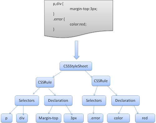
WebKit uses Flex and Bison parser generators to create parsers automatically from the CSS grammar files. As you recall from the parser introduction, Bison creates a bottom up shift-reduce parser. Firefox uses a top down parser written manually. In both cases each CSS file is parsed into a StyleSheet object. Each object contains CSS rules. The CSS rule objects contain selector and declaration objects and other objects corresponding to CSS grammar.
WebKit 使用 Flex 和 Bison 解析器生成器,从 CSS 语法文件自动生成解析器。回忆一下解析器简介:Bison 生成的是自底向上的 shift-reduce 解析器,而 Firefox 使用的是手写的自顶向下解析器。两者殊途同归:每个 CSS 文件都被解析成一个 StyleSheet 对象,每个对象包含 CSS 规则,CSS 规则对象又包含选择器对象、声明对象,以及其他与 CSS 语法对应的对象。
脚本与样式表的处理顺序
脚本
The model of the web is synchronous. Authors expect scripts to be parsed and executed immediately when the parser reaches a <script> tag.
The parsing of the document halts until the script has been executed.
If the script is external then the resource must first be fetched from the network - this is also done synchronously, and parsing halts until the resource is fetched.
This was the model for many years and is also specified in HTML4 and 5 specifications.
Authors can add the “defer” attribute to a script, in which case it will not halt document parsing and will execute after the document is parsed. HTML5 adds an option to mark the script as asynchronous so it will be parsed and executed by a different thread.
Web 的模型是同步的。作者期望解析器一遇到 <script> 标记就立即解析并执行脚本。文档的解析会就此暂停,直到脚本执行完毕。如果脚本是外部的,还必须先从网络获取资源——这同样是同步进行的,解析会一直暂停到资源获取完成。这个模型延续了很多年,也写进了 HTML4 和 HTML5 规范。作者可以给脚本加上 “defer” 属性,这样它就不会暂停文档解析,而是等文档解析完成后再执行。HTML5 还增加了把脚本标记为异步的选项,让它由另一个线程解析和执行。
预测解析
Both WebKit and Firefox do this optimization. While executing scripts, another thread parses the rest of the document and finds out what other resources need to be loaded from the network and loads them. In this way, resources can be loaded on parallel connections and overall speed is improved. Note: the speculative parser only parses references to external resources like external scripts, style sheets and images: it doesn’t modify the DOM tree - that is left to the main parser.
WebKit 和 Firefox 都做了这项优化。在执行脚本的同时,另一个线程会解析文档的剩余部分,找出还有哪些资源需要从网络加载,并把它们加载下来。这样资源就能在并行连接上加载,整体速度得以提升。注意:预测解析器只解析对外部资源的引用 (比如外部脚本、样式表和图片),它不会修改 DOM 树——那是主解析器的工作。
样式表
Style sheets on the other hand have a different model. Conceptually it seems that since style sheets don’t change the DOM tree, there is no reason to wait for them and stop the document parsing. There is an issue, though, of scripts asking for style information during the document parsing stage. If the style is not loaded and parsed yet, the script will get wrong answers and apparently this caused lots of problems. It seems to be an edge case but is quite common. Firefox blocks all scripts when there is a style sheet that is still being loaded and parsed. WebKit blocks scripts only when they try to access certain style properties that may be affected by unloaded style sheets.
样式表则是另一种模型。概念上讲,既然样式表不改变 DOM 树,似乎没有理由为它们等待、暂停文档解析。但有一个问题:脚本可能在文档解析阶段查询样式信息。如果样式尚未加载解析完毕,脚本就会得到错误的答案,这显然造成过不少问题。它看起来是个边缘情况,实际上却相当常见。Firefox 的做法是:只要还有样式表正在加载和解析,就阻塞所有脚本。WebKit 则只在脚本试图访问某些可能受未加载样式表影响的样式属性时,才阻塞脚本。
渲染树的构建
While the DOM tree is being constructed, the browser constructs another tree, the render tree. This tree is of visual elements in the order in which they will be displayed. It is the visual representation of the document. The purpose of this tree is to enable painting the contents in their correct order.
在构建 DOM 树的同时,浏览器还会构建另一棵树——渲染树。这棵树由视觉元素按照它们将要显示的顺序组成,是文档的视觉表示。它存在的目的,是让内容能按正确的顺序被绘制出来。
Firefox calls the elements in the render tree “frames”. WebKit uses the term renderer or render object.
Firefox 把渲染树中的元素称为 “frame”。WebKit 使用的术语是 renderer (渲染器) 或 render object (渲染对象)。
A renderer knows how to lay out and paint itself and its children.
渲染器知道如何布局并绘制它自己和它的子节点。
WebKit 的 RenderObject 类是所有渲染器的基类,定义如下:
class RenderObject{
  virtual void layout();
  virtual void paint(PaintInfo);
  virtual void rect repaintRect();
  Node* node;  //the DOM node
  RenderStyle* style;  // the computed style
  RenderLayer* containgLayer; //the containing z-index layer
}
Each renderer represents a rectangular area usually corresponding to a node’s CSS box, as described by the CSS2 spec. It includes geometric information like width height and position.
每个渲染器代表一个矩形区域,通常对应该节点的 CSS 盒 (如 CSS2 规范所描述)。它包含宽度、高度、位置等几何信息。
The box type is affected by the “display” value of the style attribute that is relevant to the node (see the style computation section). Here is WebKit code for deciding what type of renderer should be created for a DOM node, according to the display attribute:
盒的类型受与节点相关的样式属性中 “display” 值的影响 (见样式计算一节)。下面这段 WebKit 代码根据 display 属性决定该为 DOM 节点创建哪种渲染器:
RenderObject* RenderObject::createObject(Node* node, RenderStyle* style)
{
    Document* doc = node->document();
    RenderArena* arena = doc->renderArena();
    ...
    RenderObject* o = 0;

    switch (style->display()) {
        case NONE:
            break;
        case INLINE:
            o = new (arena) RenderInline(node);
            break;
        case BLOCK:
            o = new (arena) RenderBlock(node);
            break;
        case INLINE_BLOCK:
            o = new (arena) RenderBlock(node);
            break;
        case LIST_ITEM:
            o = new (arena) RenderListItem(node);
            break;
       ...
    }

    return o;
}
The element type is also considered: for example, form controls and tables have special frames.
元素类型同样会被考虑:例如,表单控件和表格有专门的 frame。
In WebKit if an element wants to create a special renderer, it will override the createRenderer() method.
The renderers point to style objects that contains non geometric information.
在 WebKit 中,如果一个元素想创建特殊的渲染器,它会重写 createRenderer() 方法。渲染器指向存放非几何信息的样式对象。
渲染树与 DOM 树的关系
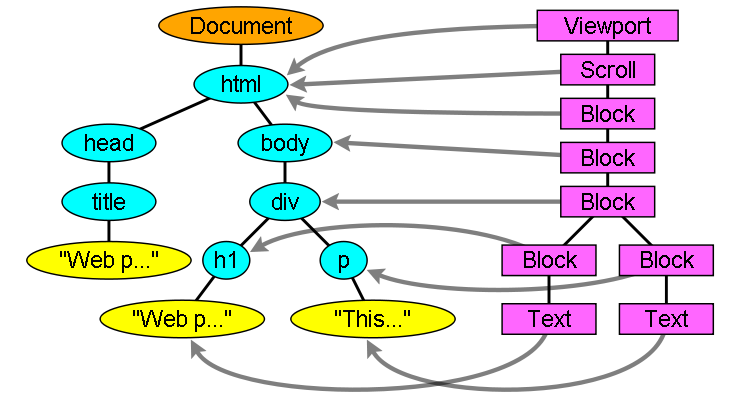
The renderers correspond to DOM elements, but the relation is not one to one. Non-visual DOM elements will not be inserted in the render tree. An example is the “head” element. Also elements whose display value was assigned to “none” will not appear in the tree (whereas elements with “hidden” visibility will appear in the tree).
渲染器与 DOM 元素相对应,但并非一一对应。非视觉的 DOM 元素不会被插入渲染树,比如 “head” 元素。display 值为 “none” 的元素也不会出现在树中 (而 visibility 为 “hidden” 的元素则会出现在树中)。
There are DOM elements which correspond to several visual objects. These are usually elements with complex structure that cannot be described by a single rectangle. For example, the “select” element has three renderers: one for the display area, one for the drop down list box and one for the button. Also when text is broken into multiple lines because the width is not sufficient for one line, the new lines will be added as extra renderers.
有些 DOM 元素对应着多个视觉对象。它们通常是结构复杂、无法用单个矩形描述的元素。例如,“select” 元素就有三个渲染器:一个用于显示区域,一个用于下拉列表框,还有一个用于按钮。当文本因宽度不足而折成多行时,新的行也会作为额外的渲染器被添加进来。
Another example of multiple renderers is broken HTML. According to the CSS spec an inline element must contain either only block elements or only inline elements. In the case of mixed content, anonymous block renderers will be created to wrap the inline elements.
另一个多渲染器的例子是残缺的 HTML。按照 CSS 规范,一个行内元素要么只包含块级元素,要么只包含行内元素。当出现混合内容时,就会创建匿名的块级渲染器来包裹那些行内元素。
Some render objects correspond to a DOM node but not in the same place in the tree. Floats and absolutely positioned elements are out of flow, placed in a different part of the tree, and mapped to the real frame. A placeholder frame is where they should have been.
有些渲染对象虽然对应某个 DOM 节点,但在树中的位置却不相同。浮动元素和绝对定位的元素脱离了文档流,被放在树的其他位置,并映射到真正的 frame 上。占位 frame 则待在它们本来应该在的位置。
构建渲染树的流程
In Firefox, the presentation is registered as a listener for DOM updates.
The presentation delegates frame creation to the FrameConstructor and the constructor resolves style (see style computation) and creates a frame.
在 Firefox 中,presentation 被注册为 DOM 更新的监听器。presentation 把 frame 的创建委托给 FrameConstructor,由后者解析样式 (见样式计算)并创建 frame。
In WebKit the process of resolving the style and creating a renderer is called “attachment”. Every DOM node has an “attach” method. Attachment is synchronous, node insertion to the DOM tree calls the new node “attach” method.
在 WebKit 中,解析样式并创建渲染器的过程称为 “attachment” (附加)。每个 DOM 节点都有一个 “attach” 方法。附加是同步的:节点插入 DOM 树时会调用新节点的 “attach” 方法。
Processing the html and body tags results in the construction of the render tree root.
The root render object corresponds to what the CSS spec calls the containing block: the top most block that contains all other blocks. Its dimensions are the viewport: the browser window display area dimensions.
Firefox calls it ViewPortFrame and WebKit calls it RenderView.
This is the render object that the document points to.
The rest of the tree is constructed as a DOM nodes insertion.
处理 html 和 body 标记会构建出渲染树的根。这个根渲染对象对应 CSS 规范所说的包含块 (containing block):包含其他所有块的最顶层块。它的尺寸就是视口 (viewport)——浏览器窗口显示区域的尺寸。Firefox 称之为 ViewPortFrame,WebKit 称之为 RenderView。这就是文档所指向的渲染对象。树的其余部分随着 DOM 节点的插入而构建。
样式计算
Building the render tree requires calculating the visual properties of each render object. This is done by calculating the style properties of each element.
构建渲染树需要计算每个渲染对象的视觉属性,也就是计算每个元素的样式属性。
The style includes style sheets of various origins, inline style elements and visual properties in the HTML (like the “bgcolor” property).The later is translated to matching CSS style properties.
样式包括各种来源的样式表、行内 style 元素,以及 HTML 中的视觉属性 (比如 “bgcolor” 属性)。后者会被转换成对应的 CSS 样式属性。
The origins of style sheets are the browser’s default style sheets, the style sheets provided by the page author and user style sheets - these are style sheets provided by the browser user (browsers let you define your favorite styles. In Firefox, for instance, this is done by placing a style sheet in the “Firefox Profile” folder).
样式表的来源有三种:浏览器的默认样式表、页面作者提供的样式表,以及用户样式表——由浏览器用户提供的样式表 (浏览器允许你定义自己喜欢的样式。以 Firefox 为例,把样式表放进 “Firefox Profile” 文件夹即可)。
Style computation brings up a few difficulties:
-
Style data is a very large construct, holding the numerous style properties, this can cause memory problems.
-
Finding the matching rules for each element can cause performance issues if it’s not optimized. Traversing the entire rule list for each element to find matches is a heavy task. Selectors can have complex structure that can cause the matching process to start on a seemingly promising path that is proven to be futile and another path has to be tried.
For example - this compound selector:
div div div div{
...
}
Means the rules apply to a
<div>who is the descendant of 3 divs. Suppose you want to check if the rule applies for a given<div>element. You choose a certain path up the tree for checking. You may need to traverse the node tree up just to find out there are only two divs and the rule does not apply. You then need to try other paths in the tree. -
Applying the rules involves quite complex cascade rules that define the hierarchy of the rules.
样式计算带来了几个难点:
-
样式数据是非常庞大的结构,存放着大量样式属性,这可能引发内存问题。
-
如果不加优化,为每个元素查找匹配规则会引发性能问题。为每个元素遍历整个规则列表来找匹配是一项繁重的任务。选择器可能具有复杂的结构,导致匹配过程从一条看似有希望的路径出发,最终被证明是徒劳,只能再去尝试另一条路径。
例如这个复合选择器:
div div div div{
...
}
意思是规则应用于「作为 3 个 div 后代的
<div>」。假设你要检查这条规则是否适用于某个给定的<div>元素,你会选定树上的一条向上路径去检查。你可能沿着节点树向上遍历一番,才发现只有两个 div,规则并不适用,于是又得去尝试树中的其他路径。 -
应用规则本身涉及相当复杂的层叠规则 (它们定义了规则之间的层级关系)。
我们来看看浏览器是如何面对这些问题的:
样式数据的共享
WebKit nodes references style objects (RenderStyle). These objects can be shared by nodes in some conditions. The nodes are siblings or cousins and:
- The elements must be in the same mouse state (e.g., one can’t be in
:hoverwhile the other isn’t) - Neither element should have an id
- The tag names should match
- The class attributes should match
- The set of mapped attributes must be identical
- The link states must match
- The focus states must match
- Neither element should be affected by attribute selectors, where affected is defined as having any selector match that uses an attribute selector in any position within the selector at all
- There must be no inline style attribute on the elements
- There must be no sibling selectors in use at all. WebCore simply throws a global switch when any sibling selector is encountered and disables style sharing for the entire document when they are present. This includes the
+selector and selectors like:first-childand:last-child.
WebKit 的节点引用样式对象 (RenderStyle)。在某些条件下,这些对象可以被多个节点共享。这些节点互为兄弟或堂兄弟,并且:
- 元素必须处于相同的鼠标状态 (比如,不能一个处于
:hover而另一个不是) - 两个元素都不能有 id
- 标记名必须相同
- class 属性必须相同
- 映射属性 (mapped attributes) 的集合必须完全一致
- 链接状态必须相同
- 焦点状态必须相同
- 两个元素都不能受属性选择器影响——只要选择器的任何位置用到了属性选择器并构成匹配,就算受影响
- 元素上不能有行内 style 属性
- 完全不能使用兄弟选择器。WebCore 只要遇到任何兄弟选择器,就会打开一个全局开关,对整个文档禁用样式共享。这包括
+选择器,以及:first-child、:last-child这类选择器。
Firefox 的规则树
Firefox has two extra trees for easier style computation: the rule tree and style context tree. WebKit also has style objects but they are not stored in a tree like the style context tree, only the DOM node points to its relevant style.
为了简化样式计算,Firefox 额外维护了两棵树:规则树 (rule tree) 和样式上下文树 (style context tree)。WebKit 也有样式对象,但它们并不存放在类似样式上下文树的结构里,只由 DOM 节点指向自己相关的样式。
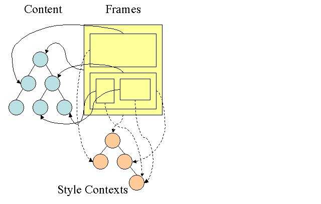
The style contexts contain end values. The values are computed by applying all the matching rules in the correct order and performing manipulations that transform them from logical to concrete values. For example, if the logical value is a percentage of the screen it will be calculated and transformed to absolute units. The rule tree idea is really clever. It enables sharing these values between nodes to avoid computing them again. This also saves space.
样式上下文包含最终值。这些值的计算方式是:按正确的顺序应用所有匹配的规则,并做一些处理,把逻辑值转换为具体值。例如,如果逻辑值是屏幕的百分比,就会被计算并转换成绝对单位。规则树的想法非常巧妙:它让这些值可以在节点之间共享,避免重复计算,同时也节省了空间。
All the matched rules are stored in a tree. The bottom nodes in a path have higher priority. The tree contains all the paths for rule matches that were found. Storing the rules is done lazily. The tree isn’t calculated at the beginning for every node, but whenever a node style needs to be computed the computed paths are added to the tree.
所有匹配到的规则都存放在一棵树里。路径中越靠下的节点优先级越高。这棵树包含了已发现的所有规则匹配路径。规则的存储是惰性的:树不会一开始就为每个节点计算好,而是在某个节点的样式需要计算时,才把计算出的路径添加到树中。
The idea is to see the tree paths as words in a lexicon. Lets say we already computed this rule tree:
可以把树中的路径看作词典里的单词。假设我们已经算出了这样一棵规则树:
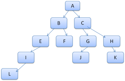
Suppose we need to match rules for another element in the content tree, and find out the matched rules (in the correct order) are B-E-I. We already have this path in the tree because we already computed path A-B-E-I-L. We will now have less work to do.
假设我们要为内容树中的另一个元素匹配规则,发现匹配到的规则 (按正确顺序) 是 B–E–I。由于我们之前已经计算过路径 A–B–E–I–L,这条路径在树中已经存在,于是现在要做的工作就变少了。
让我们看看这棵树是如何为我们省力的。
划分为若干结构体
The style contexts are divided into structs. Those structs contain style information for a certain category like border or color. All the properties in a struct are either inherited or non inherited. Inherited properties are properties that unless defined by the element, are inherited from its parent. Non inherited properties (called “reset” properties) use default values if not defined.
样式上下文被划分为若干结构体 (struct)。每个结构体包含某一类别的样式信息,比如边框或颜色。结构体中的属性要么全部可继承,要么全部不可继承。可继承属性是指:除非元素自己定义,否则从父元素继承。不可继承属性 (称为 “reset” 属性) 在未定义时使用默认值。
The tree helps us by caching entire structs (containing the computed end values) in the tree. The idea is that if the bottom node didn’t supply a definition for a struct, a cached struct in an upper node can be used.
这棵树的帮助在于:它把整个结构体 (含计算好的最终值) 缓存在树中。思路是,如果底部节点没有为某个结构体提供定义,就可以直接使用上层节点缓存的结构体。
用规则树计算样式上下文
When computing the style context for a certain element, we first compute a path in the rule tree or use an existing one. We then begin to apply the rules in the path to fill the structs in our new style context. We start at the bottom node of the path - the one with the highest precedence (usually the most specific selector) and traverse the tree up until our struct is full. If there is no specification for the struct in that rule node, then we can greatly optimize - we go up the tree until we find a node that specifies it fully and simply point to it - that’s the best optimization - the entire struct is shared. This saves computation of end values and memory.
为某个元素计算样式上下文时,我们先在规则树中计算出一条路径,或者复用一条已有的。然后沿路径应用规则,填充新样式上下文中的结构体。我们从路径的底部节点开始——它的优先级最高 (通常也是最具体的选择器)——向上遍历树,直到结构体被填满。如果那个规则节点对该结构体没有任何定义,我们就能大幅优化:沿树向上找到一个完整定义了它的节点,直接指向它——这是最理想的优化,整个结构体都被共享了。这既省去了最终值的计算,也节省了内存。
If we find partial definitions we go up the tree until the struct is filled.
如果找到的是部分定义,就继续向上遍历,直到结构体填满。
If we didn’t find any definitions for our struct then, in case the struct is an “inherited” type, we point to the struct of our parent in the context tree. In this case we also succeeded in sharing structs. If it’s a reset struct then default values will be used.
如果我们的结构体没有找到任何定义:若它是「可继承」类型,就指向上下文树中父节点的结构体——这种情况下我们同样实现了结构体共享;若它是 reset 类型,则使用默认值。
If the most specific node does add values then we need to do some extra calculations for transforming it to actual values. We then cache the result in the tree node so it can be used by children.
如果最具体的节点确实添加了值,我们就需要做一些额外计算,把它转换为实际值,然后把结果缓存在树节点中,供子节点使用。
In case an element has a sibling or a brother that points to the same tree node then the entire style context can be shared between them.
如果一个元素有兄弟节点指向同一个树节点,那么它们之间可以共享整个样式上下文。
来看一个例子。假设我们有这样一段 HTML:
<html>
  <body>
    <div class="err" id="div1">
      <p>
        this is a <span class="big"> big error </span>
        this is also a
        <span class="big"> very  big  error</span> error
      </p>
    </div>
    <div class="err" id="div2">another error</div>
  </body>
</html>
以及下面这些规则:
div {margin: 5px; color:black}
.err {color:red}
.big {margin-top:3px}
div span {margin-bottom:4px}
#div1 {color:blue}
#div2 {color:green}
To simplify things let’s say we need to fill out only two structs: the color struct and the margin struct. The color struct contains only one member: the color The margin struct contains the four sides.
为简化问题,假设我们只需要填充两个结构体:颜色结构体和外边距结构体。颜色结构体只有一个成员:颜色本身;外边距结构体则包含四条边。
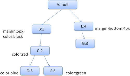
The resulting rule tree will look like this (the nodes are marked with the node name: the number of the rule they point at):
得到的规则树如下 (节点的标注格式为「节点名:它指向的规则编号」):
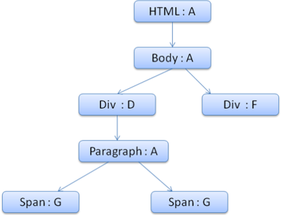
The context tree will look like this (node name: rule node they point to):
上下文树如下 (标注格式为「节点名:它指向的规则节点」):
Suppose we parse the HTML and get to the second <div> tag. We need to create a style context for this node and fill its style structs.
假设我们解析 HTML 时遇到了第二个 <div> 标记。我们需要为这个节点创建样式上下文,并填充它的样式结构体。
We will match the rules and discover that the matching rules for the <div> are 1, 2 and 6.
This means there is already an existing path in the tree that our element can use and we just need to add another node to it for rule 6 (node F in the rule tree).
经过规则匹配,我们发现这个 <div> 匹配的规则是 1、2 和 6。这意味着树中已经有一条现成的路径可供我们的元素使用,我们只需为规则 6 再添加一个节点 (规则树中的节点 F)。
We will create a style context and put it in the context tree. The new style context will point to node F in the rule tree.
我们会创建一个样式上下文并放进上下文树。这个新的样式上下文将指向规则树中的节点 F。
We now need to fill the style structs. We will begin by filling out the margin struct. Since the last rule node (F) doesn’t add to the margin struct, we can go up the tree until we find a cached struct computed in a previous node insertion and use it. We will find it on node B, which is the uppermost node that specified margin rules.
接下来要填充样式结构体,先从外边距结构体开始。由于最后一个规则节点 (F) 没有为外边距结构体添加内容,我们可以沿树向上,找到之前插入节点时计算并缓存下来的结构体,直接使用。我们会在节点 B 找到它——那是定义了外边距规则的最上层节点。
We do have a definition for the color struct, so we can’t use a cached struct. Since color has one attribute we don’t need to go up the tree to fill other attributes. We will compute the end value (convert string to RGB etc) and cache the computed struct on this node.
颜色结构体在这里有定义,所以不能用缓存的结构体。由于颜色只有一个属性,也就不需要向上遍历去填充其他属性。我们会计算最终值 (把字符串转成 RGB 等),并把算好的结构体缓存在这个节点上。
The work on the second <span> element is even easier. We will match the rules and come to the conclusion that it points to rule G, like the previous span.
Since we have siblings that point to the same node, we can share the entire style context and just point to the context of the previous span.
第二个 <span> 元素的工作就更轻松了。经过规则匹配,我们得出它指向规则 G,和前一个 span 一样。既然两个兄弟节点指向同一个节点,就可以共享整个样式上下文——直接指向前一个 span 的上下文即可。
For structs that contain rules that are inherited from the parent, caching is done on the context tree (the color property is actually inherited, but Firefox treats it as reset and caches it on the rule tree).
对于包含「从父节点继承的规则」的结构体,缓存做在上下文树上 (color 属性其实是可继承的,但 Firefox 把它当作 reset 属性处理,缓存在规则树上)。
For instance if we added rules for fonts in a paragraph:
比如,如果我们给段落添加字体规则:
p {font-family: Verdana; font size: 10px; font-weight: bold}Then the paragraph element, which is a child of the div in the context tree, could have shared the same font struct as his parent. This is if no font rules were specified for the paragraph.
那么这个段落元素 (它在上下文树中是 div 的子节点) 本可以和它的父节点共享同一个字体结构体——前提是段落自己没有指定任何字体规则。
In WebKit, who does not have a rule tree, the matched declarations are traversed four times. First non-important high priority properties are applied (properties that should be applied first because others depend on them, such as display), then high priority important, then normal priority non-important, then normal priority important rules. This means that properties that appear multiple times will be resolved according to the correct cascade order. The last wins.
WebKit 没有规则树,所以会把匹配到的声明遍历四遍:先应用非 important 的高优先级属性 (那些需要最先应用、因为其他属性依赖它们的属性,比如 display),然后是高优先级 important 属性,接着是普通优先级非 important 属性,最后是普通优先级 important 规则。这样,多次出现的属性就会按照正确的层叠顺序被解决——后来者胜出。
So to summarize: sharing the style objects (entirely or some of the structs inside them) solves issues 1 and 3. The Firefox rule tree also helps in applying the properties in the correct order.
总结一下:共享样式对象 (整个共享,或共享其中部分结构体) 解决了难点 1 和难点 3。Firefox 的规则树还有助于按正确顺序应用属性。
为便于匹配而整理规则
There are several sources for style rules:
- CSS rules, either in external style sheets or in style elements.
p {color: blue} - Inline style attributes like
<p style="color: blue" /> - HTML visual attributes (which are mapped to relevant style rules)
<p bgcolor="blue" />
样式规则有几种来源:
- CSS 规则,来自外部样式表或 style 元素。
p {color: blue} - 行内 style 属性,比如
<p style="color: blue" /> - HTML 视觉属性 (它们会被映射到相应的样式规则)
<p bgcolor="blue" />
The last two are easily matched to the element since he owns the style attributes and HTML attributes can be mapped using the element as the key.
后两种很容易与元素匹配:style 属性归元素自己所有,HTML 属性也能以元素为键进行映射。
As noted previously in issue #2, the CSS rule matching can be trickier. To solve the difficulty, the rules are manipulated for easier access.
正如前面难点 2 所提到的,CSS 的规则匹配要棘手得多。为了解决这个难题,浏览器会对规则做一番整理,方便访问。
After parsing the style sheet, the rules are added to one of several hash maps, according to the selector. There are maps by id, by class name, by tag name and a general map for anything that doesn’t fit into those categories. If the selector is an id, the rule will be added to the id map, if it’s a class it will be added to the class map etc.
解析完样式表后,规则会按选择器被添加到几个哈希表之一:按 id 的表、按类名的表、按标记名的表,以及一个容纳其余所有规则的通用表。选择器是 id 的,规则进 id 表;是类的,进类表;以此类推。
This manipulation makes it much easier to match rules. There is no need to look in every declaration: we can extract the relevant rules for an element from the maps. This optimization eliminates 95+% of the rules, so that they need not even be considered during the matching process(4.1).
这样整理之后,规则匹配就容易多了。不必逐条检查每个声明:直接从哈希表里取出与元素相关的规则即可。这项优化能排除掉 95% 以上的规则,让它们在匹配过程中根本不需要被考虑 (4.1)。
Let’s see for example the following style rules:
以下面这些样式规则为例:
p.error {color: red}
#messageDiv {height: 50px}
div {margin: 5px}
The first rule will be inserted into the class map. The second into the id map and the third into the tag map.
第一条规则会插入类表,第二条插入 id 表,第三条插入标记表。
对于下面这段 HTML 片段:
<p class="error">an error occurred</p>
<div id=" messageDiv">this is a message</div>
We will first try to find rules for the p element. The class map will contain an “error” key under which the rule for “p.error” is found. The div element will have relevant rules in the id map (the key is the id) and the tag map. So the only work left is finding out which of the rules that were extracted by the keys really match.
我们先为 p 元素找规则。类表中有一个 “error” 键,在它下面能找到 “p.error” 这条规则。div 元素的相关规则则在 id 表 (键是 id) 和标记表里。所以剩下的工作,只是从按键取出的这些规则里找出真正匹配的那些。
For example if the rule for the div was
例如,如果 div 的规则是
table div {margin: 5px}it will still be extracted from the tag map, because the key is the rightmost selector, but it would not match our div element, who does not have a table ancestor.
它仍会从标记表中被取出,因为键是最右边的选择器;但它并不匹配我们的 div 元素——它没有 table 祖先。
Both WebKit and Firefox do this manipulation.
WebKit 和 Firefox 都做了这样的整理。
按正确的层叠顺序应用规则
The style object has properties corresponding to every visual attribute (all CSS attributes but more generic). If the property is not defined by any of the matched rules, then some properties can be inherited by the parent element style object. Other properties have default values.
样式对象拥有与每个视觉属性一一对应的属性 (即所有 CSS 属性,但更通用)。如果某个属性没有被任何匹配的规则定义,那么有些属性可以从父元素的样式对象继承,其余的则使用默认值。
The problem begins when there is more than one definition - here comes the cascade order to solve the issue.
麻烦出在同一属性有多个定义的时候——这就轮到层叠顺序出场了。
样式表的层叠顺序
A declaration for a style property can appear in several style sheets, and several times inside a style sheet. This means the order of applying the rules is very important. This is called the “cascade” order. According to CSS2 spec, the cascade order is (from low to high):
- Browser declarations
- User normal declarations
- Author normal declarations
- Author important declarations
- User important declarations
同一个样式属性的声明可能出现在多个样式表里,也可能在同一个样式表里出现多次。这意味着应用规则的顺序非常重要,这个顺序被称为「层叠」(cascade) 顺序。按照 CSS2 规范,层叠顺序 (从低到高) 是:
- 浏览器声明
- 用户普通声明
- 作者普通声明
- 作者 important 声明
- 用户 important 声明
The browser declarations are least important and the user overrides the author only if the declaration was marked as important. Declarations with the same order will be sorted by specificity and then the order they are specified. The HTML visual attributes are translated to matching CSS declarations . They are treated as author rules with low priority.
浏览器声明的分量最轻,而用户只有在声明标了 important 时才能覆盖作者。层叠等级相同的声明会按特异性排序,然后再按声明出现的先后排序。HTML 视觉属性会被转换成对应的 CSS 声明,被当作低优先级的作者规则处理。
特异性
The selector specificity is defined by the CSS2 specification as follows:
- count 1 if the declaration it is from is a ‘style’ attribute rather than a rule with a selector, 0 otherwise (= a)
- count the number of ID attributes in the selector (= b)
- count the number of other attributes and pseudo-classes in the selector (= c)
- count the number of element names and pseudo-elements in the selector (= d)
选择器的特异性 (specificity) 由 CSS2 规范定义如下:
- 如果声明来自 “style” 属性而不是带选择器的规则,计 1,否则计 0 (= a)
- 数一数选择器中 ID 属性的个数 (= b)
- 数一数选择器中其他属性和伪类的个数 (= c)
- 数一数选择器中元素名和伪元素的个数 (= d)
Concatenating the four numbers a-b-c-d (in a number system with a large base) gives the specificity.
把 a-b-c-d 四个数字连起来 (放在一个基数足够大的进位制里),就得到了特异性。
The number base you need to use is defined by the highest count you have in one of the categories.
需要使用的基数,取决于四类计数中最大的那个数。
For example, if a=14 you can use hexadecimal base. In the unlikely case where a=17 you will need a 17 digits number base. The later situation can happen with a selector like this: html body div div p… (17 tags in your selector… not very likely).
例如,a=14 时用十六进制就够了。在 a=17 这种不太可能出现的情况下,你就需要 17 进制了。后一种情况可能来自这样的选择器:html body div div p… (选择器里挂着 17 个标记……不太现实)。
几个例子:
 *             {}  /* a=0 b=0 c=0 d=0 -> specificity = 0,0,0,0 */
 li            {}  /* a=0 b=0 c=0 d=1 -> specificity = 0,0,0,1 */
 li:first-line {}  /* a=0 b=0 c=0 d=2 -> specificity = 0,0,0,2 */
 ul li         {}  /* a=0 b=0 c=0 d=2 -> specificity = 0,0,0,2 */
 ul ol+li      {}  /* a=0 b=0 c=0 d=3 -> specificity = 0,0,0,3 */
 h1 + *[rel=up]{}  /* a=0 b=0 c=1 d=1 -> specificity = 0,0,1,1 */
 ul ol li.red  {}  /* a=0 b=0 c=1 d=3 -> specificity = 0,0,1,3 */
 li.red.level  {}  /* a=0 b=0 c=2 d=1 -> specificity = 0,0,2,1 */
 #x34y         {}  /* a=0 b=1 c=0 d=0 -> specificity = 0,1,0,0 */
 style=""          /* a=1 b=0 c=0 d=0 -> specificity = 1,0,0,0 */
规则排序
After the rules are matched, they are sorted according to the cascade rules. WebKit uses bubble sort for small lists and merge sort for big ones. WebKit implements sorting by overriding the “>” operator for the rules:
规则匹配完成后,会按层叠规则排序。WebKit 对小列表用冒泡排序,对大列表用归并排序。WebKit 通过为规则重载 “>” 运算符来实现排序:
static bool operator >(CSSRuleData& r1, CSSRuleData& r2)
{
    int spec1 = r1.selector()->specificity();
    int spec2 = r2.selector()->specificity();
    return (spec1 == spec2) : r1.position() > r2.position() : spec1 > spec2;
}
渐进处理
WebKit uses a flag that marks if all top level style sheets (including @imports) have been loaded. If the style is not fully loaded when attaching, place holders are used and it is marked in the document, and they will be recalculated once the style sheets were loaded.
WebKit 用一个标志位记录是否所有顶层样式表 (包括 @import 的) 都已加载完毕。如果附加时样式尚未完全加载,就先使用占位符并在文档中做记号,等样式表加载完成后再重新计算。
布局
When the renderer is created and added to the tree, it does not have a position and size. Calculating these values is called layout or reflow.
渲染器刚被创建并添加到树中时,还没有位置和尺寸。计算这些值的过程称为布局 (layout) 或回流 (reflow)。
HTML uses a flow based layout model, meaning that most of the time it is possible to compute the geometry in a single pass. Elements later “in the flow” typically do not affect the geometry of elements that are earlier “in the flow”, so layout can proceed left-to-right, top-to-bottom through the document. There are exceptions: for example, HTML tables may require more than one pass.
HTML 采用基于流的布局模型,也就是说大多数时候,一趟遍历就能算出所有几何信息。「流」中靠后的元素通常不会影响靠前元素的几何属性,所以布局可以从左到右、从上到下地推进整个文档。也有例外:比如 HTML 表格就可能需要不止一趟。
The coordinate system is relative to the root frame. Top and left coordinates are used.
坐标系相对于根 frame,使用 top 和 left 坐标。
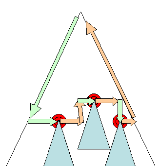
Layout is a recursive process. It begins at the root renderer, which corresponds to the <html> element of the HTML document. Layout continues recursively through some or all of the frame hierarchy, computing geometric information for each renderer that requires it.
布局是一个递归的过程。它从根渲染器开始——根渲染器对应 HTML 文档的 <html> 元素——然后沿着 frame 层级递归推进 (可能覆盖部分或全部层级),为每个需要计算的渲染器算出几何信息。
The position of the root renderer is 0,0 and its dimensions are the viewport - the visible part of the browser window.
根渲染器的位置是 0,0,尺寸是视口——浏览器窗口的可见部分。
All renderers have a “layout” or “reflow” method, each renderer invokes the layout method of its children that need layout.
所有渲染器都有 “layout” 或 “reflow” 方法,每个渲染器会调用其需要布局的子节点的 layout 方法。
脏位系统
In order not to do a full layout for every small change, browsers use a “dirty bit” system. A renderer that is changed or added marks itself and its children as “dirty”: needing layout.
为了避免每次小改动都做全量布局,浏览器使用「脏位」(dirty bit) 系统。被修改或新添加的渲染器会把自己和它的子节点标记为「脏」:即需要布局。
There are two flags: “dirty”, and “children are dirty” which means that although the renderer itself may be OK, it has at least one child that needs a layout.
有两种标志位:“dirty” (自身脏了) 和 “children are dirty” (子节点脏了)——后者表示渲染器本身没问题,但它至少有一个子节点需要布局。
全局布局与增量布局
Layout can be triggered on the entire render tree - this is “global” layout. This can happen as a result of:
- A global style change that affects all renderers, like a font size change.
- As a result of a screen being resized
布局可以在整棵渲染树上触发——这是「全局」布局。它可能由以下原因引起:
- 影响所有渲染器的全局样式变化,比如字号变化。
- 屏幕尺寸发生调整。
Layout can be incremental, only the dirty renderers will be laid out (this can cause some damage which will require extra layouts).
布局也可以是增量的:只对脏的渲染器做布局 (这可能带来一些副作用,需要额外的布局来弥补)。
Incremental layout is triggered (asynchronously) when renderers are dirty. For example when new renderers are appended to the render tree after extra content came from the network and was added to the DOM tree.
当渲染器变脏时,增量布局会被 (异步地) 触发。例如,新内容从网络到达并被添加进 DOM 树之后,新的渲染器被追加到渲染树上。
异步布局与同步布局
Incremental layout is done asynchronously. Firefox queues “reflow commands” for incremental layouts and a scheduler triggers batch execution of these commands. WebKit also has a timer that executes an incremental layout - the tree is traversed and “dirty” renderers are layout out.
增量布局是异步完成的。Firefox 会把增量布局的「回流命令」放进队列,由调度器触发这些命令的批量执行。WebKit 也有一个定时器来执行增量布局——遍历树,为「脏」的渲染器做布局。
Scripts asking for style information, like “offsetHeight” can trigger incremental layout synchronously.
脚本查询样式信息 (比如 “offsetHeight”) 时,可能会同步触发增量布局。
Global layout will usually be triggered synchronously.
全局布局通常是同步触发的。
Sometimes layout is triggered as a callback after an initial layout because some attributes, like the scrolling position changed.
有时布局会在初次布局之后作为回调再次触发,因为某些属性 (比如滚动位置) 发生了变化。
优化
When a layout is triggered by a “resize” or a change in the renderer position(and not size), the renders sizes are taken from a cache and not recalculated…
当布局由 “resize” 或渲染器位置 (而非尺寸) 变化触发时,渲染器的尺寸直接从缓存中取,不再重新计算……
In some cases only a sub tree is modified and layout does not start from the root. This can happen in cases where the change is local and does not affect its surroundings - like text inserted into text fields (otherwise every keystroke would trigger a layout starting from the root).
某些情况下只有一棵子树被修改,布局便不必从根开始。这适用于变化只影响局部、波及不到周围的场景——比如在文本框里输入文字 (否则每敲一个键都会触发一次从根开始的布局)。
布局过程
The layout usually has the following pattern:
- Parent renderer determines its own width.
- Parent goes over children and:
- Place the child renderer (sets its x and y).
- Calls child layout if needed - they are dirty or we are in a global layout, or for some other reason - which calculates the child’s height.
- Parent uses children’s accumulative heights and the heights of margins and padding to set its own height - this will be used by the parent renderer’s parent.
- Sets its dirty bit to false.
布局通常遵循这样的模式:
- 父渲染器确定自己的宽度。
- 父渲染器逐个处理子节点:
- 放置子渲染器 (设置它的 x 和 y)。
- 必要时调用子节点的布局——子节点是脏的、正处于全局布局、或者其他原因——从而算出子节点的高度。
- 父渲染器用子节点的累计高度、加上外边距和内边距的高度,得出自己的高度——这个值会被父渲染器的父节点使用。
- 把自己的脏位设为 false。
Firefox uses a “state” object(nsHTMLReflowState) as a parameter to layout (termed “reflow”). Among others the state includes the parents width.
Firefox 用一个 “state” 对象 (nsHTMLReflowState) 作为布局 (它称之为 “reflow”) 的参数。这个 state 包含父节点的宽度等信息。
The output of the Firefox layout is a “metrics” object(nsHTMLReflowMetrics). It will contain the renderer computed height.
Firefox 布局的输出是一个 “metrics” 对象 (nsHTMLReflowMetrics),其中包含渲染器计算出的高度。
宽度计算
The renderer’s width is calculated using the container block’s width, the renderer’s style “width” property, the margins and borders.
渲染器的宽度由以下几项算出:容器块的宽度、渲染器样式中的 “width” 属性、外边距和边框。
For example the width of the following div:
例如下面这个 div 的宽度:
<div style="width: 30%"/>Would be calculated by WebKit as the following(class RenderBox method calcWidth):
- The container width is the maximum of the containers availableWidth and 0. The availableWidth in this case is the contentWidth which is calculated as:
WebKit 会这样计算 (RenderBox 类的 calcWidth 方法):
- 容器宽度取容器的 availableWidth 与 0 中的较大者。这里的 availableWidth 就是 contentWidth,计算方式为:
clientWidth() - paddingLeft() - paddingRight()clientWidth and clientHeight represent the interior of an object excluding border and scrollbar.
clientWidth 和 clientHeight 表示对象的内部区域,不含边框和滚动条。
-
The elements width is the “width” style attribute. It will be calculated as an absolute value by computing the percentage of the container width.
-
The horizontal borders and paddings are now added.
-
元素的宽度就是样式属性 “width” 的值。它会按容器宽度的百分比被计算成一个绝对值。
-
然后加上水平方向的边框和内边距。
So far this was the calculation of the “preferred width”. Now the minimum and maximum widths will be calculated.
到这里算出的是「首选宽度」(preferred width)。接下来还要计算最小宽度和最大宽度。
If the preferred width is greater then the maximum width, the maximum width is used. If it is less then the minimum width (the smallest unbreakable unit) then the minimum width is used.
如果首选宽度大于最大宽度,就使用最大宽度;如果小于最小宽度 (最小的不可折断单元),就使用最小宽度。
The values are cached in case a layout is needed, but the width does not change.
这些值会被缓存起来,以备需要布局但宽度不变的情况使用。
折行
When a renderer in the middle of a layout decides that it needs to break, the renderer stops and propagates to the layout’s parent that it needs to be broken. The parent creates the extra renderers and calls layout on them.
当渲染器在布局进行到一半时发现自己需要折行,它会停下来,把「需要折行」这件事向上传播给布局的父节点。父节点创建出额外的渲染器,并对它们调用布局。
绘制
In the painting stage, the render tree is traversed and the renderer’s “paint()” method is called to display content on the screen. Painting uses the UI infrastructure component.
在绘制阶段,渲染树被遍历,渲染器的 “paint()” 方法被调用,把内容显示到屏幕上。绘制使用 UI 基础设施组件。
全局绘制与增量绘制
Like layout, painting can also be global - the entire tree is painted - or incremental. In incremental painting, some of the renderers change in a way that does not affect the entire tree. The changed renderer invalidates its rectangle on the screen. This causes the OS to see it as a “dirty region” and generate a “paint” event. The OS does it cleverly and coalesces several regions into one. In Chrome it is more complicated because the renderer is in a different process then the main process. Chrome simulates the OS behavior to some extent. The presentation listens to these events and delegates the message to the render root. The tree is traversed until the relevant renderer is reached. It will repaint itself (and usually its children).
和布局一样,绘制也分全局绘制 (整棵树都被绘制) 和增量绘制。在增量绘制中,一部分渲染器的变化不影响整棵树。发生变化的渲染器会把自己在屏幕上的矩形区域标记为失效,操作系统于是把它视为一块「脏区域」,并生成一个 “paint” 事件。操作系统在这方面做得很聪明,会把多块区域合并成一块。Chrome 的情况更复杂一些,因为渲染器和主进程不在同一个进程里,Chrome 在一定程度上模拟了操作系统的行为。presentation 监听这些事件,并把消息委托给渲染树的根。之后遍历树,直到找到相关的渲染器,它会重绘自己 (通常还有它的子节点)。
绘制顺序
CSS2 defines the order of the painting process. This is actually the order in which the elements are stacked in the stacking contexts. This order affects painting since the stacks are painted from back to front. The stacking order of a block renderer is:
- background color
- background image
- border
- children
- outline
CSS2 定义了绘制过程的顺序。它实际上就是元素在层叠上下文中的堆叠顺序。这个顺序会影响绘制,因为堆叠是从后往前绘制的。块级渲染器的堆叠顺序是:
- 背景色
- 背景图
- 边框
- 子节点
- 轮廓 (outline)
Firefox 的显示列表
Firefox goes over the render tree and builds a display list for the painted rectangular. It contains the renderers relevant for the rectangular, in the right painting order (backgrounds of the renderers, then borders etc).
Firefox 会遍历渲染树,为要绘制的矩形区域构建一个显示列表。列表按正确的绘制顺序,收录与该矩形相关的渲染器 (先是渲染器们的背景,然后是边框,等等)。
That way the tree needs to be traversed only once for a repaint instead of several times - painting all backgrounds, then all images, then all borders etc.
这样一次重绘只需遍历一遍树,而不是很多遍——先画所有背景、再画所有图片、再画所有边框……
Firefox optimizes the process by not adding elements that will be hidden, like elements completely beneath other opaque elements.
Firefox 还做了优化:不把会被遮住的元素加进列表,比如完全压在其他不透明元素下面的元素。
WebKit 的矩形存储
Before repainting, WebKit saves the old rectangle as a bitmap. It then paints only the delta between the new and old rectangles.
重绘之前,WebKit 会把旧矩形保存为位图,然后只绘制新旧矩形之间的差异部分。
动态变化
The browsers try to do the minimal possible actions in response to a change. So changes to an element’s color will cause only repaint of the element. Changes to the element position will cause layout and repaint of the element, its children and possibly siblings. Adding a DOM node will cause layout and repaint of the node. Major changes, like increasing font size of the “html” element, will cause invalidation of caches, relayout and repaint of the entire tree.
面对变化,浏览器会尽量做最少的动作。所以元素颜色变了,只会重绘该元素;元素位置变了,会对该元素、它的子节点、可能还有兄弟节点做布局和重绘;添加一个 DOM 节点,会对该节点做布局和重绘。而重大变化 (比如增大 “html” 元素的字号) 会导致缓存失效,整棵树重新布局、重新绘制。
渲染引擎的线程
The rendering engine is single threaded. Almost everything, except network operations, happens in a single thread. In Firefox and Safari this is the main thread of the browser. In Chrome it’s the tab process main thread.
渲染引擎是单线程的。除了网络操作,几乎一切都发生在同一个线程里。在 Firefox 和 Safari 中,它是浏览器的主线程;在 Chrome 中,它是标签页进程的主线程。
Network operations can be performed by several parallel threads. The number of parallel connections is limited (usually 2 - 6 connections).
网络操作可以由多个并行线程执行。并行连接的数量是有限的 (通常是 2 到 6 个)。
事件循环
The browser main thread is an event loop. It’s an infinite loop that keeps the process alive. It waits for events (like layout and paint events) and processes them. This is Firefox code for the main event loop:
浏览器主线程是一个事件循环——一个让进程保持存活的无限循环。它等待事件 (比如布局和绘制事件) 并处理它们。下面是 Firefox 主事件循环的代码:
while (!mExiting)
    NS_ProcessNextEvent(thread);
CSS2 视觉模型
画布
According to the CSS2 specification, the term canvas describes “the space where the formatting structure is rendered”: where the browser paints the content.
按照 CSS2 规范,画布 (canvas) 一词描述的是「渲染格式化结构的空间」——也就是浏览器绘制内容的地方。
The canvas is infinite for each dimension of the space but browsers choose an initial width based on the dimensions of the viewport.
画布在空间的每个维度上都是无限的,但浏览器会基于视口的尺寸选定一个初始宽度。
According to www.w3.org/TR/CSS2/zindex.html, the canvas is transparent if contained within another, and given a browser defined color if it is not.
按照 www.w3.org/TR/CSS2/zindex.html,画布如果被包含在另一块画布里,就是透明的;否则会被赋予一个由浏览器定义的颜色。
CSS 盒模型
The CSS box model describes the rectangular boxes that are generated for elements in the document tree and laid out according to the visual formatting model.
CSS 盒模型描述的是为文档树中的元素生成、并按视觉格式化模型进行布局的矩形盒。
Each box has a content area (e.g. text, an image, etc.) and optional surrounding padding, border, and margin areas.
每个盒都有一块内容区域 (比如文本、图片等),以及可选的环绕内边距 (padding)、边框 (border) 和外边距 (margin) 区域。
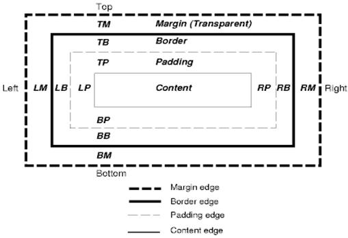
Each node generates 0…n such boxes.
每个节点会生成 0 到 n 个这样的盒。
All elements have a “display” property that determines the type of box that will be generated.
所有元素都有一个 “display” 属性,决定生成哪种类型的盒。
几个例子:
block: generates a block box.
inline: generates one or more inline boxes.
none: no box is generated.
The default is inline but the browser style sheet may set other defaults. For example: the default display for the “div” element is block.
默认值是 inline,但浏览器样式表可以设置其他默认值。例如:“div” 元素的默认 display 是 block。
默认样式表的示例可以在这里找到:www.w3.org/TR/CSS2/sample.html。
定位方案
There are three schemes:
- Normal: the object is positioned according to its place in the document. This means its place in the render tree is like its place in the DOM tree and laid out according to its box type and dimensions
- Float: the object is first laid out like normal flow, then moved as far left or right as possible
- Absolute: the object is put in the render tree in a different place than in the DOM tree
定位方案有三种:
- 普通 (Normal):对象按它在文档中的位置定位。也就是说,它在渲染树中的位置与在 DOM 树中的位置一致,并按自己的盒类型和尺寸布局。
- 浮动 (Float):对象先按普通流布局,然后尽可能地向左或向右移动。
- 绝对 (Absolute):对象在渲染树中的位置与在 DOM 树中的位置不同。
The positioning scheme is set by the “position” property and the “float” attribute.
- static and relative cause a normal flow
- absolute and fixed cause absolute positioning
定位方案由 “position” 属性和 “float” 属性设定。
- static 和 relative 进入普通流
- absolute 和 fixed 进入绝对定位
In static positioning no position is defined and the default positioning is used. In the other schemes, the author specifies the position: top, bottom, left, right.
static 定位不定义位置,使用默认定位。其他方案中,由作者指定位置:top、bottom、left、right。
The way the box is laid out is determined by:
- Box type
- Box dimensions
- Positioning scheme
- External information such as image size and the size of the screen
盒的布局方式由以下因素决定:
- 盒类型
- 盒尺寸
- 定位方案
- 外部信息,比如图片尺寸和屏幕大小
盒类型
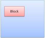
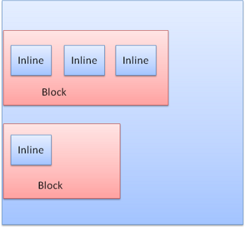
Block box: forms a block - has its own rectangle in the browser window.
块级盒 (block box):形成一个块——在浏览器窗口中拥有自己的矩形。
Inline box: does not have its own block, but is inside a containing block.
行内盒 (inline box):没有自己的块,而是待在某个包含块里面。
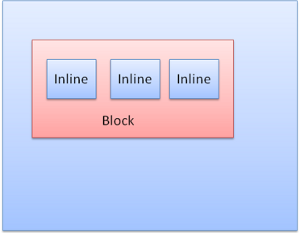
Blocks are formatted vertically one after the other. Inlines are formatted horizontally.
块级盒垂直方向上一个接一个地排列,行内盒则在水平方向上排列。
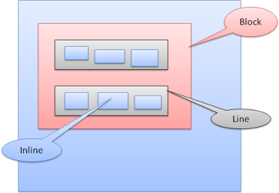
Inline boxes are put inside lines or “line boxes”. The lines are at least as tall as the tallest box but can be taller, when the boxes are aligned “baseline” - meaning the bottom part of an element is aligned at a point of another box other then the bottom. If the container width is not enough, the inlines will be put on several lines. This is usually what happens in a paragraph.
行内盒被放进行、或者说「行盒」(line box) 里。行至少和其中最高的盒一样高,也可能更高——当盒按「基线」(baseline) 对齐时,元素的底部会对齐到另一个盒上非底部的某个位置。如果容器宽度不够,行内盒就会被排到多行上。段落里通常就是这么回事。
定位
相对定位
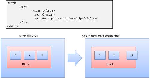
Relative positioning - positioned like usual and then moved by the required delta.
相对定位——先按常规定位,再按要求的偏移量移动。
浮动
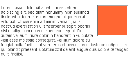
A float box is shifted to the left or right of a line. The interesting feature is that the other boxes flow around it. The HTML:
浮动盒会被移到一行的左端或右端。有趣的是,其他盒会环绕着它排布。比如这段 HTML:
<p>
  <img style="float: right" src="images/image.gif" width="100" height="100">
  Lorem ipsum dolor sit amet, consectetuer...
</p>
显示出来是这样:
绝对定位与固定定位
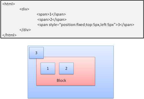
The layout is defined exactly regardless of the normal flow. The element does not participate in the normal flow. The dimensions are relative to the container. In fixed, the container is the viewport.
布局被精确指定,与普通流无关。元素不参与普通流。尺寸相对于容器而言。fixed 定位的容器是视口。
分层表示
This is specified by the z-index CSS property. It represents the third dimension of the box: its position along the “z axis”.
分层由 CSS 属性 z-index 指定。它代表盒的第三个维度:沿「z 轴」的位置。
The boxes are divided into stacks (called stacking contexts). In each stack the back elements will be painted first and the forward elements on top, closer to the user. In case of overlap the foremost element will hide the former element.
盒被划分成一个个堆叠 (称为层叠上下文,stacking context)。每个堆叠中,靠后的元素先绘制,靠前的元素画在上面、离用户更近。发生重叠时,最前面的元素会遮住后面的元素。
The stacks are ordered according to the z-index property. Boxes with “z-index” property form a local stack. The viewport has the outer stack.
堆叠按 z-index 属性排序。带 “z-index” 属性的盒形成局部堆叠,视口则持有最外层的堆叠。
例如:
<style type="text/css">
  div {
    position: absolute;
    left: 2in;
    top: 2in;
  }
</style>

<p>
  <div
    style="z-index: 3;background-color:red; width: 1in; height: 1in; ">
  </div>
  <div
    style="z-index: 1;background-color:green;width: 2in; height: 2in;">
  </div>
</p>
结果是这样:

Although the red div precedes the green one in the markup, and would have been painted before in the regular flow, the z-index property is higher, so it is more forward in the stack held by the root box.
虽然红色 div 在标记中先于绿色 div 出现,按常规流本应先被绘制,但它的 z-index 属性更高,所以在根盒持有的堆叠中更靠前。
参考资料
-
浏览器架构
- Grosskurth, Alan. A Reference Architecture for Web Browsers (pdf)
- Gupta, Vineet. How Browsers Work - Part 1 - Architecture
-
解析
- Aho, Sethi, Ullman, Compilers: Principles, Techniques, and Tools (aka the “Dragon book”), Addison-Wesley, 1986
- Rick Jelliffe. The Bold and the Beautiful: two new drafts for HTML 5.
-
Firefox
- L. David Baron, Faster HTML and CSS: Layout Engine Internals for Web Developers.
- L. David Baron, Faster HTML and CSS: Layout Engine Internals for Web Developers (Google tech talk video)
- L. David Baron, Mozilla’s Layout Engine
- L. David Baron, Mozilla Style System Documentation
- Chris Waterson, Notes on HTML Reflow
- Chris Waterson, Gecko Overview
- Alexander Larsson, The life of an HTML HTTP request
-
WebKit
- David Hyatt, Implementing CSS(part 1)
- David Hyatt, An Overview of WebCore
- David Hyatt, WebCore Rendering
- David Hyatt, The FOUC Problem
-
W3C 规范
-
浏览器构建指南
其他译本
This page has been translated into Japanese, twice! How Browsers Work - Behind the Scenes of Modern Web Browsers (ja) by @kosei and also ブラウザってどうやって動いてるの?(モダンWEBブラウザシーンの裏側 by @ikeike443 and @kiyoto01.
本文被翻译成日文两次!一次是 @kosei 的 How Browsers Work - Behind the Scenes of Modern Web Browsers (ja),另一次是 @ikeike443 和 @kiyoto01 的ブラウザってどうやって動いてるの?(モダンWEBブラウザシーンの裏側。
感谢每一个人!